World Heritage Site Shrine and Temple of Nikko
Identity
Advised by Doug Scott
Fall 2024
Identity
Editorial
Web
Spatial
Advised by Doug Scott
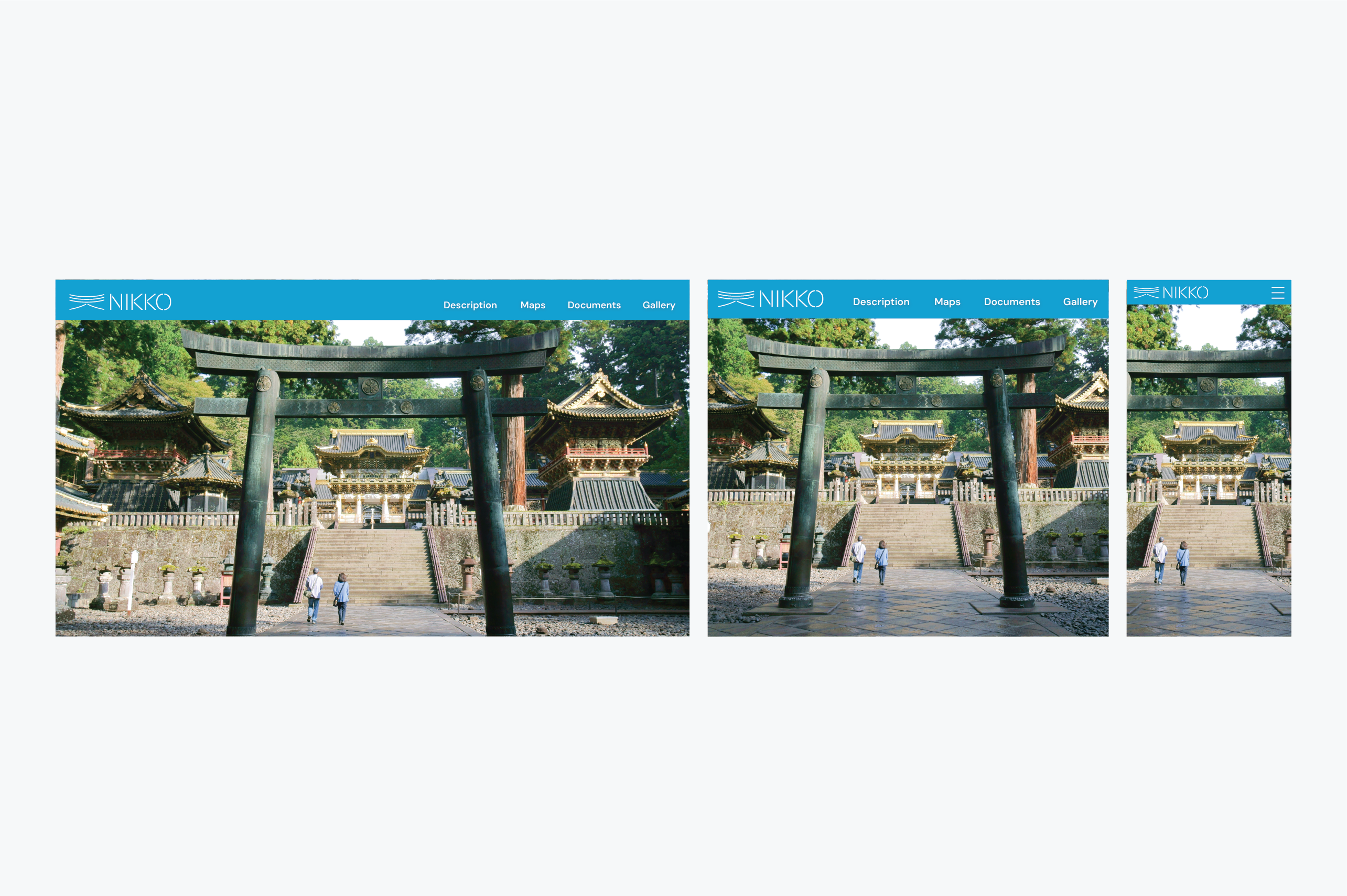
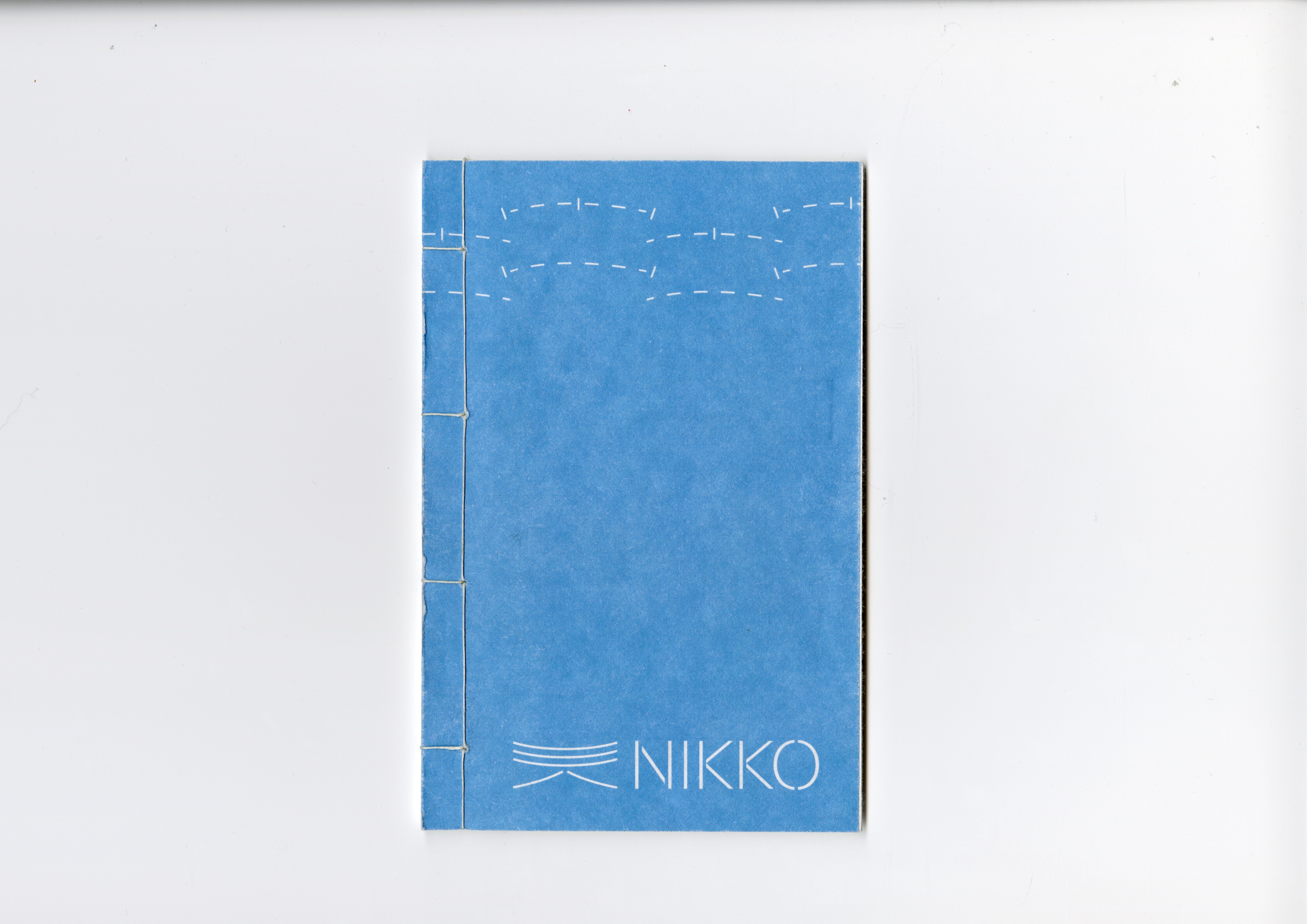
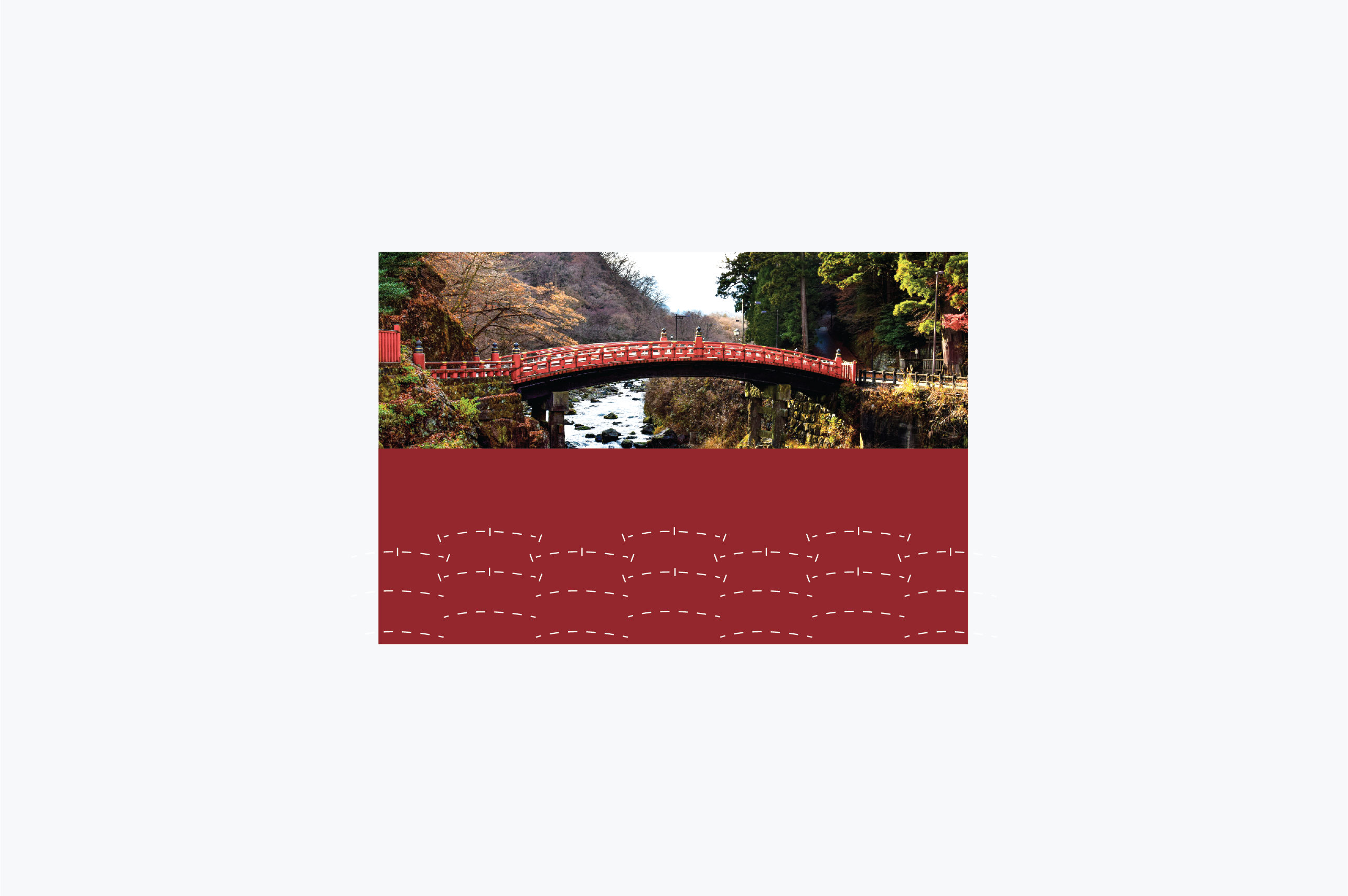
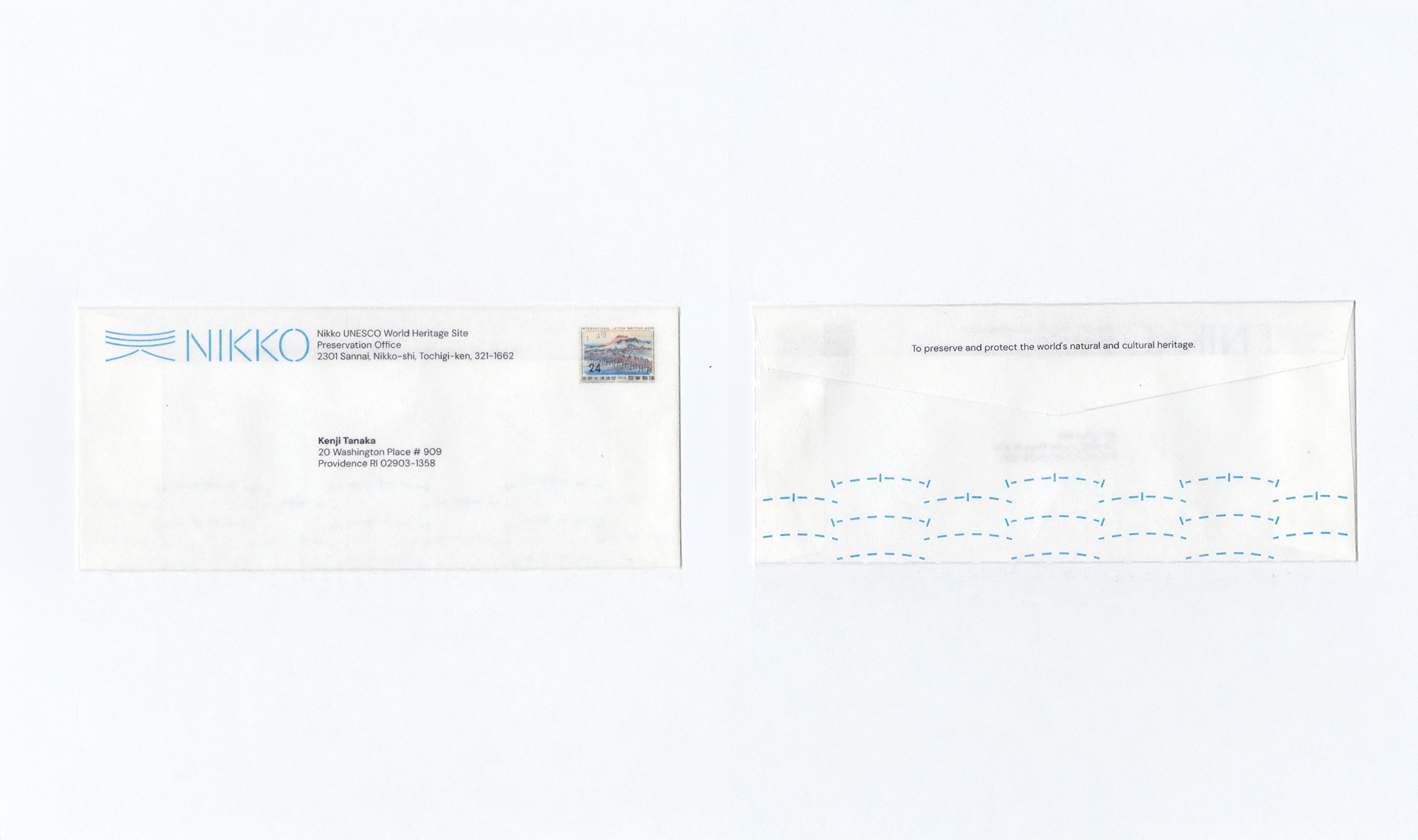
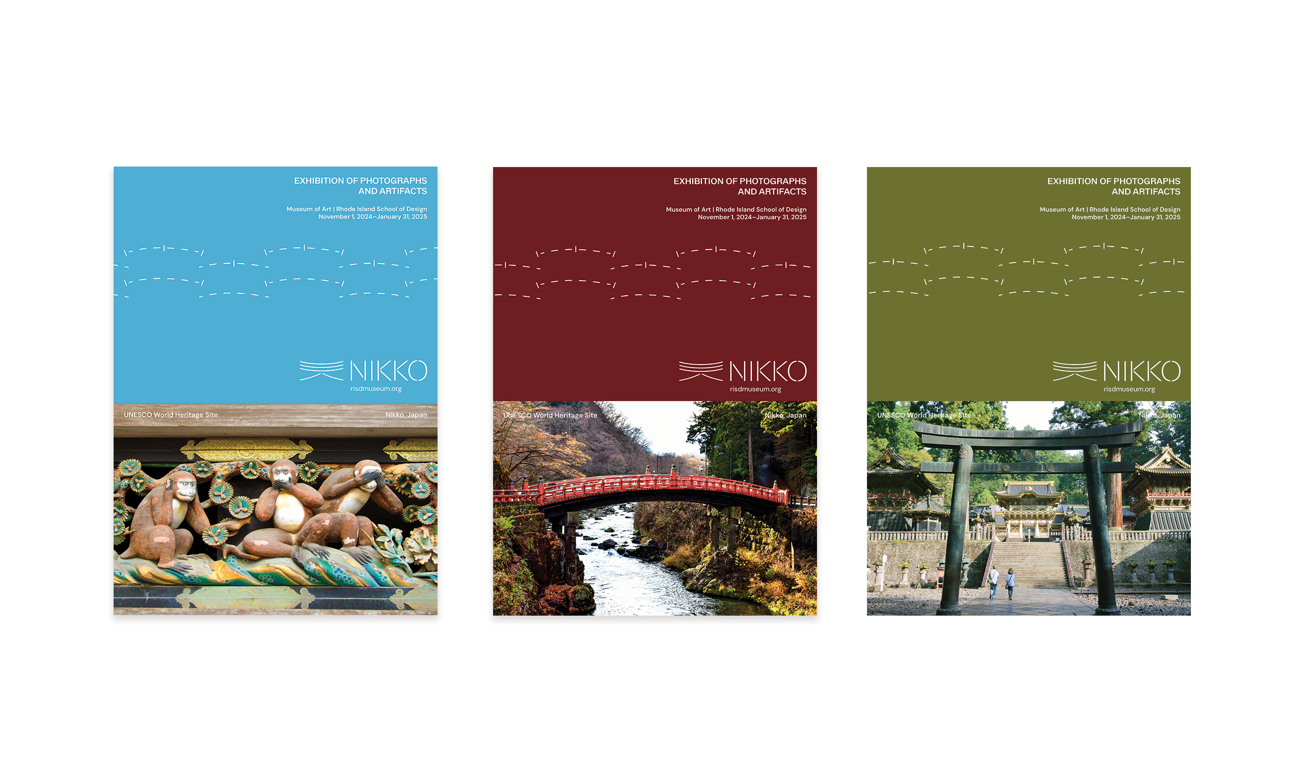
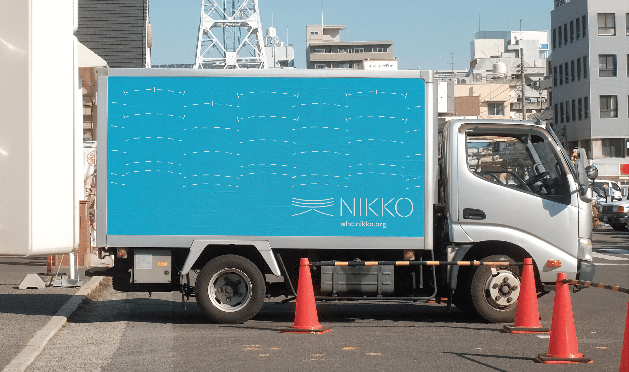
A conceptual branding for Nikko World Heritage. Brand developed from spatial openness and repetition of shrine of Nikko. The logo is inspired by the Nikko Toshogu Shrine Ishidorii gate, which is a structure of curved line at the top and supported by two flared structures.
The pattern is a combination by repetition of Japanese architecture of roof and iconic red bridge of Nikko. The transparency of paper, logo, and color palette was created to emphasize the idea of airiness when arrive at the temple.
The pattern is a combination by repetition of Japanese architecture of roof and iconic red bridge of Nikko. The transparency of paper, logo, and color palette was created to emphasize the idea of airiness when arrive at the temple.

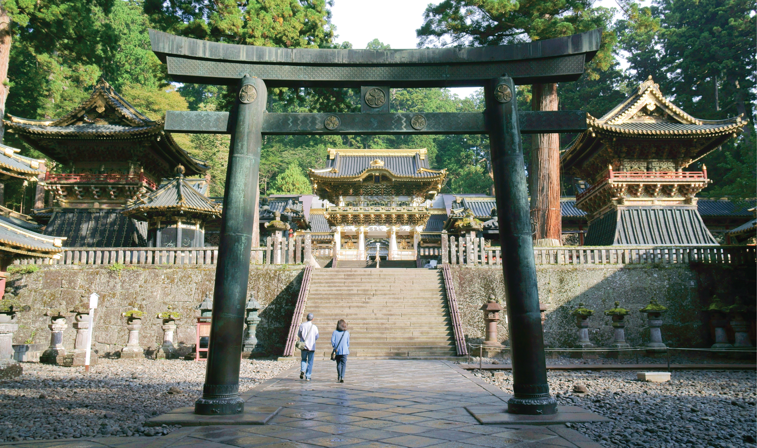
Nikko Toshugu shirne, Ishidorii gate


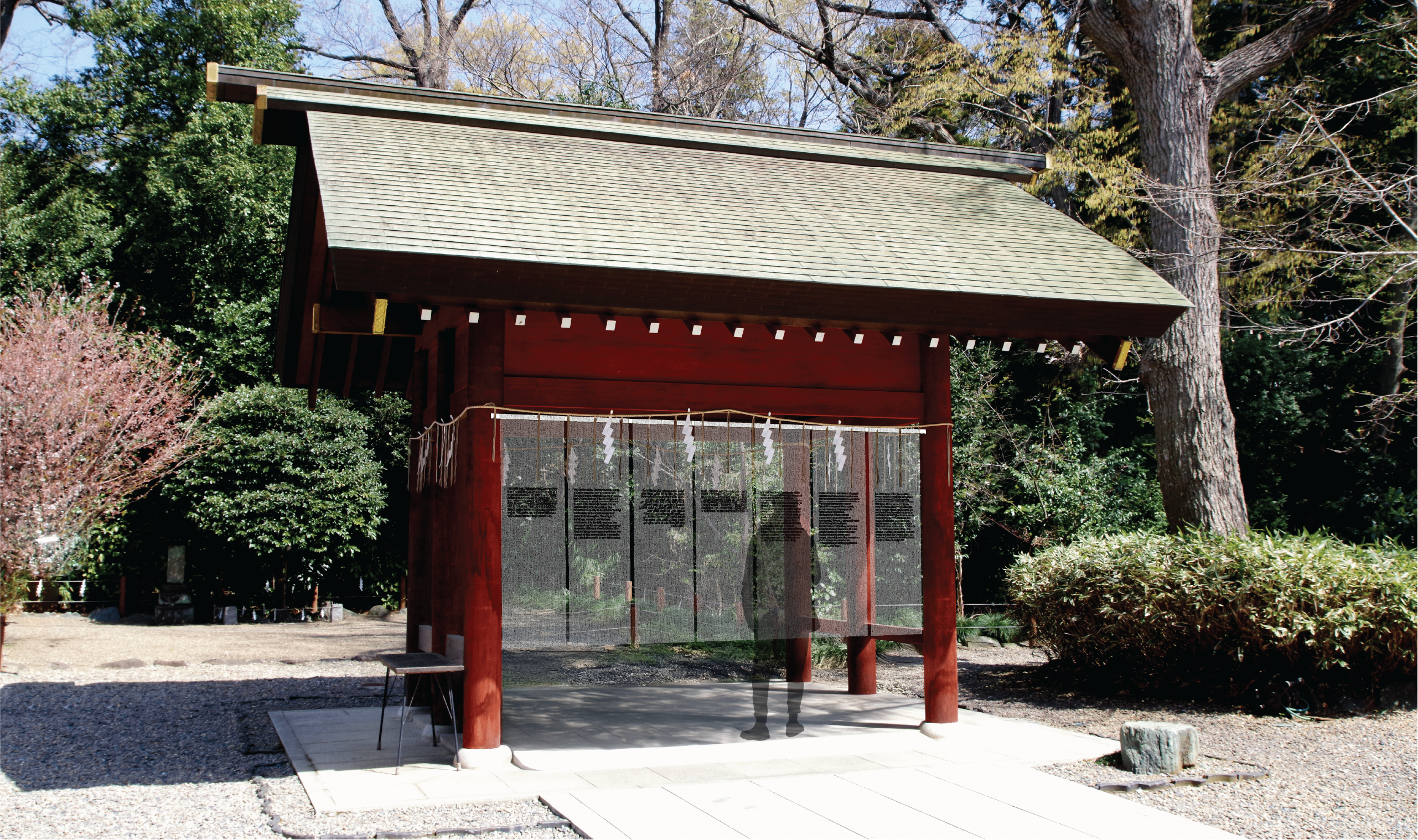
Site sign with UNESCO Official Languages